MEA’s logo did and continues to speak to our mission and members, but the Union wanted to give it a bit of a refresh as we head into the future. Here is a look at where MEA has been and where we are going, with a history of our logo.
HISTORY
1929
Maine Teachers Association
1930
Maine Teachers Association
This version of the logo includes the lamp of knowledge which would be included into the next iteration of the logo for the next 50+ years.
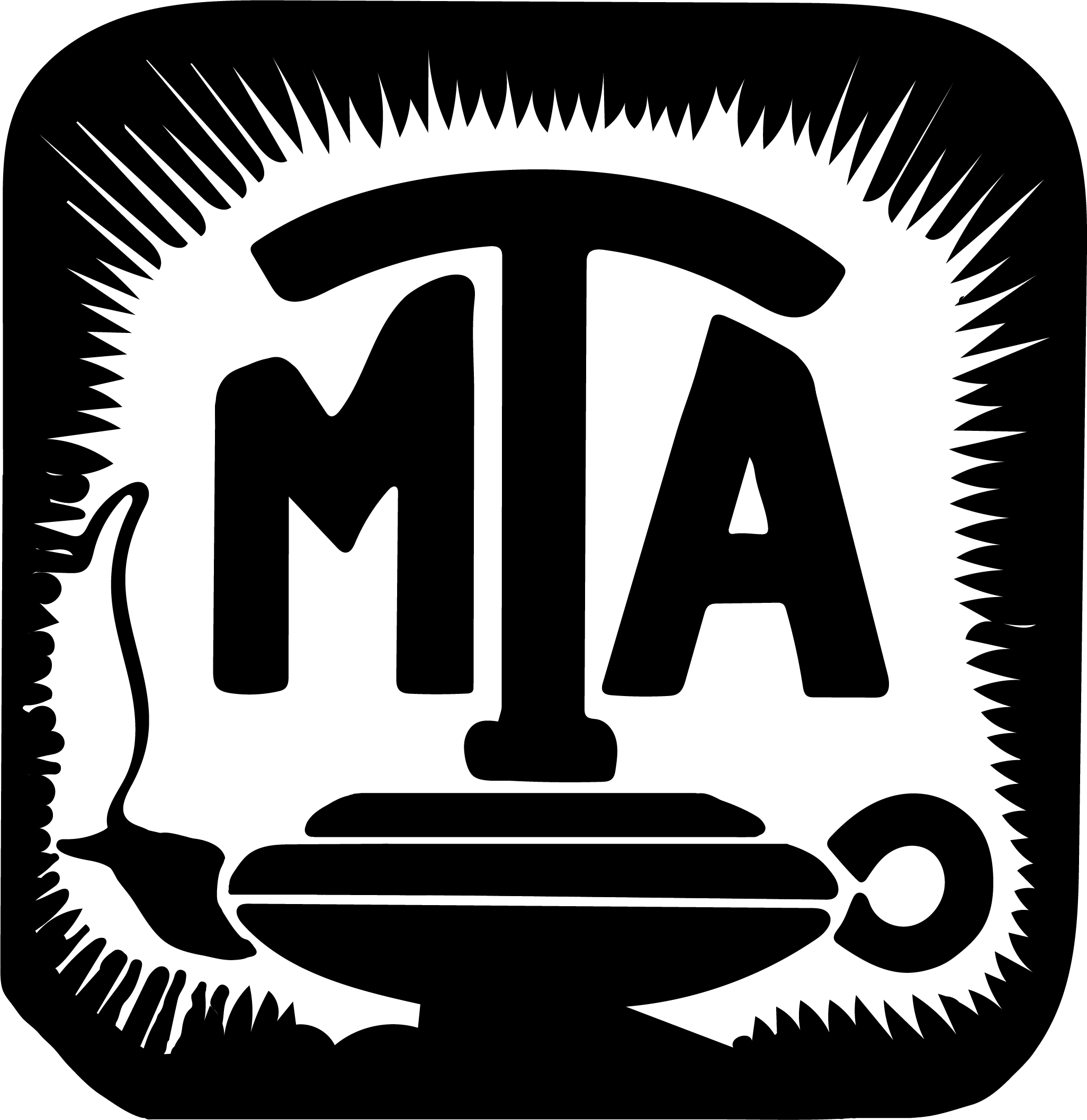
1981
Maine Teachers Association
1993
Maine Teachers Association
1994
Maine Education Association
MTA changed its name to the Maine Education Association to be inclusive of all the educators the union represents.
2008
Maine Education Association

LOGO
Legacy Swoosh
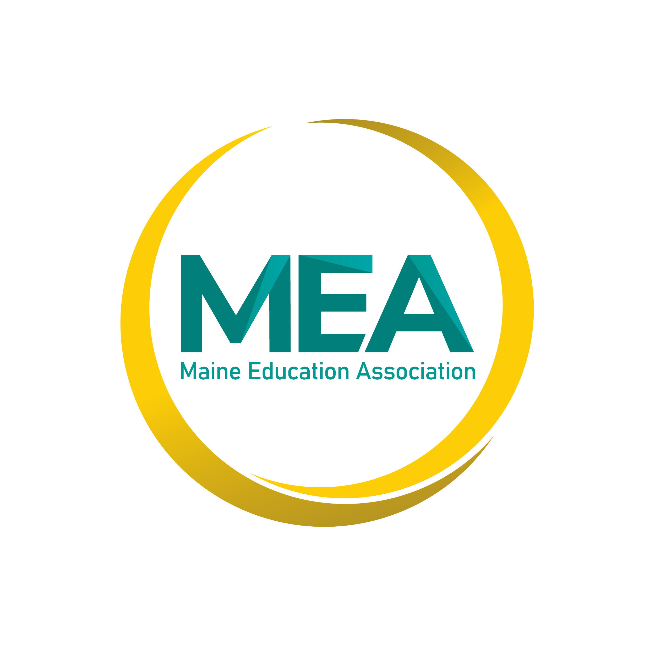
We don’t want to abandon our past. The new arcs are a tribute to the former logo’s swoosh through the letters, now modernized, wrapping around the letters signifying the history of the past is interwoven with the future.
Angled Vectors
Lighter elements, in the shape of angled vectors, provide depth and visual interest, while the positioning of these elements lead the eye through the letterforms in the “forward” direction-as the Union is always moving forward to support our members.
Clipped E
A bold, modern sans serif typeface conveys a clean, modern look, as MEA steps into the future. The clipped “E” allows for close positioning of the letters and increases their sense of connectedness, symbolizing how the Union is always close to its members at every turn.
Community
Circles project positivity and unity which is why MEA’s letters are joined by a set of interlocking arcs. The circle formed by these arcs shows how separate elements form a cohesive whole, symbolizing how the MEA is made up of our local associations. The outer element encircling the letterforms creates a sense of protection, while the openings intimate all are welcome. Uneven sizing shows how the strengths of all are needed to complete the logo, just as our collective voice is needed in our advocacy work.
